You work hard on your presentation. You practice, you make your slides "just so," but it still falls flat! Kristine Krafts gives you her top tips to make sure that doesn't happen next time!

Dr. Kristine Krafts
Dr. Kristine Krafts
DISCLAIMER: The opinions expressed on this episode are those of my guest and I alone, and do not reflect those of the organizations with which either of us is affiliated. Neither Dr. Krafts nor I have any relevant financial disclosures.
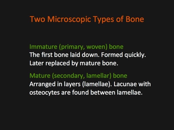
The images below are generously provided by Dr. Krafts.


Time-Stamped Notes
- 2:00: Intro to Dr. Krafts
- 4:50: Dr. Krafts and the rubber chicken
- 5:38: You don't have to follow someone else's path
- 9:05: Why a podcast on presentations?
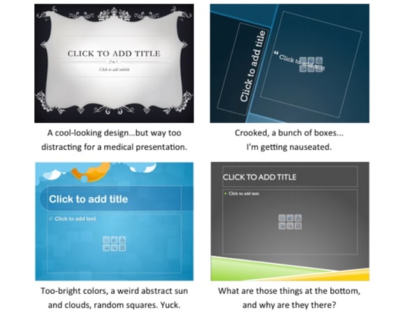
- 11:05: Tip 1: Pick a simple template
- 18:03: Tip 2: Don’t crowd the slide with text
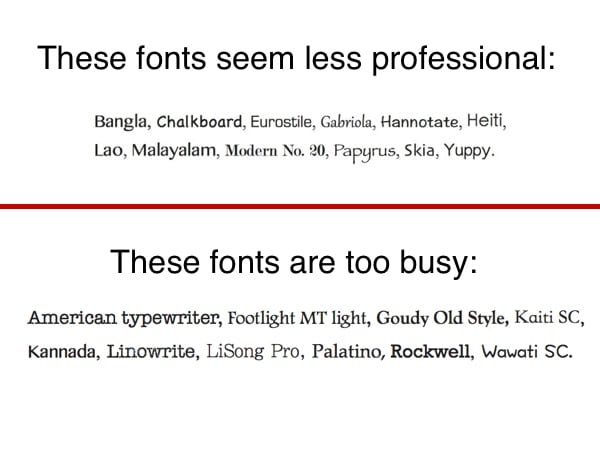
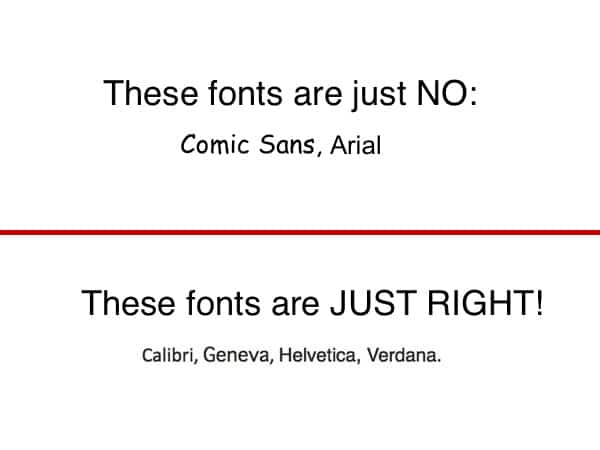
- 24:05: Tip 3: Use the right font
- 31:49: Tip 4: Don’t read off your slides
- 41:02: Tip 5: Make your graphs awesome
- 47:17: Resources available at pathologystudent.com for blood bankers
Further information:
- Slide Design Tips: Garr Reynolds Top Ten Slide Tips, http://www.garrreynolds.com/preso-tips/design/, accessed 05/20/2016
- Indiana University Resources to Meet the Challenges of Lecturing, http://citl.indiana.edu/resources_files/teaching-resources1/teaching-handbook-items/Lecture_resources.php, accessed 05/20/2016


Trackbacks/Pingbacks